Saturday, September 28, 2013

Logo


Before creating my logo I thought that it was going to be easy. However I noticed that it takes time to create a logo because there’s a lot of planning and editing that comes along with it.

In the process of creating a logo, I noticed that I had to use my creative thinking skills. I had to think outside the box. I had to make sure that people would be able to understand my message without me explaining it.

The most important discovery I made in creating my logo was how much brainstorming it takes to create one. For example, there are so many options in creating a logo, such as what font, color, symbol, and message is going to be used. There’s so much selection, but one has to pick one and that’s the hardest part.

The videos, powerpoint and reading material were very helpful in creating a logo. They explained the entire process, from the mission, to brainstorming and to unveiling the finished product.

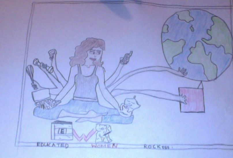
My logo represents a woman that is capable of doing anything she wants. However, most women are limited in becoming successful because they do not have access to a education. One day I will like to have my own organization, Educated Women Rocks to make sure girls and women all over the world get an opportunity to get educated because my motto is, "if a woman get educated she can take over the world CAUSE SHE ROCKSSS!!

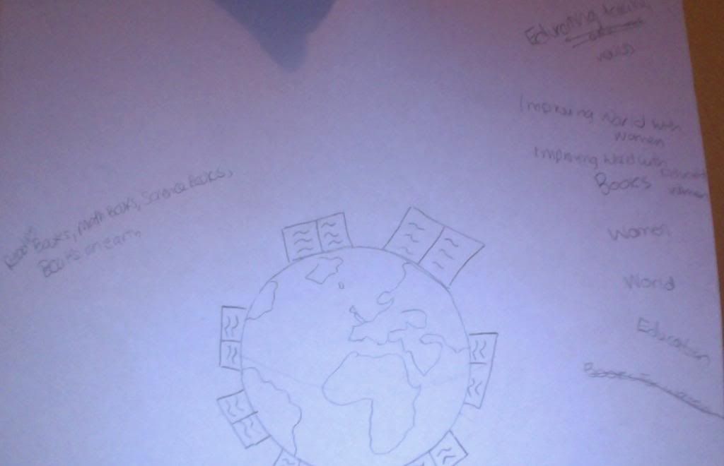
 Below are the different stages I had to take in order to create my logo: 

1st Draft- Figuring out my mission, my motto and the symbol.
http://i1292.photobucket.com/albums/b574/artishappinessaed200/Photoon9-28-13at513PM2_zps34c70fe6.jpg

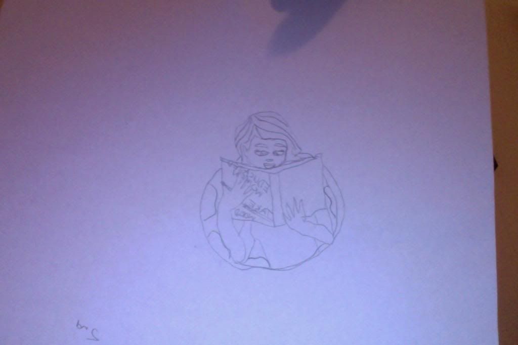
2nd Draft- Creating a logo
http://i1292.photobucket.com/albums/b574/artishappinessaed200/Photoon9-28-13at513PM_zpsbc86f05c.jpg

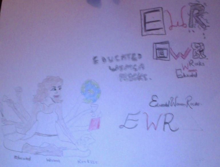
3rd Draft- Finding the perfect font, changing my symbol and adding color.
http://i1292.photobucket.com/albums/b574/artishappinessaed200/Photoon9-28-13at512PM5_zps0cd78a95.jpg

4th Draft- Final copy: Finalizing color and making sure everything was put together.
http://i1292.photobucket.com/albums/b574/artishappinessaed200/Photoon9-28-13at512PM4_zps43ebfa0d.jpg

The image I used as an inspiration was from: http://livingselfcare.wordpress.com/about/

Gallery Visit


Victor Vasarely
Vega-Nor (1969)
78 ¾ x 78 ¾ inches
Oil on canvas 

Victor Vasarely’s artwork, Vega-Nor made an impression on me because he used Opalt, a form of art that use manipulation of color and lines to fool our perception. It was interesting because he believes that this form of art can be understood by anyone without a educational background. The art piece has no story to tell, history to know or symbols to interpret, he just used lines to reinforce illusion.

http://i1292.photobucket.com/albums/b574/artishappinessaed200/VICTOR_zpsa5a18456.jpg

Amedeo Nodigliani
La Jeune Bonne (The Servant Girl) (1918)
60 x 24 inches
Oil on canvas

In Amedeo Nodigliani’s artwork, La Jeune Bonne (The Servant Girl) the woman is wearing a dark dress with white collar, modest hairstyle waiting in the corner with folded hands, waiting for instructions. This made an impression on me because even though the title and her dress attire represent a woman that is a servant, one can also see that she has dignity. This was shown through color and line unifying together as a composition.

http://i1292.photobucket.com/albums/b574/artishappinessaed200/AMEDO_zps2d033d71.jpg

Nikki S. Lee
The Hip Hop Project (1) (2001)
21 ¼ x 28 inches
Chromogenic Color Print

In Nikki S. Lee’s artwork, The Hip Hop Project, she addresses social and culture identity. She states how human changes clothes to alter their appearances. I was able to connect to this artwork because being the first generation American, I tend to always change my appearances, my dress attire and my diet. My parents always yelling, “Even though you were born here, you can never forget your roots!!”

http://i1292.photobucket.com/albums/b574/artishappinessaed200/NikkiSlEE_zps47311d2a.jpg

Carrie Mae Weems
Colored People Series (1997)
30 x 30 inches
Toned and/or color-stained silver prints

Carrie Mae Weems documented her African American experience through shades of darkness in her artwork, Colored People Series. She states that photographs remind us that we all see through filter- whether they are cultural, social, learned, taught and inherited. I was able to connect to this because members in my family still haven’t accepted the shades that they are in. I have aunts that bleached their skin to look lighter because in the community that they were raised in believed that if you were a darker shade, you were considered “dark and ugly.”

http://i1292.photobucket.com/albums/b574/artishappinessaed200/CARRIEMAEW_zps0591fdbe.jpg

Franz Marc
DIE WOLFE (BSLKSNKRIEG) THE WOLVES (BALKANWAR) (1948)
27 7/8 x 55 inches
Oil on canvas

Franz Marc changed his form of art to the concentration of world events. He used wolfs in his work, DIE WOLFE (BSLKSNKRIEG) THE WOLVES (BALKANWAR) as a replacement of the earlier and peaceful nations before World War I occurred.  I wished I could look more about his artwork, he used the symbol of wolfs to demonstrated the vicious act that were being committed. However, I wish I could get a better image of what the countries looked during that time.

http://i1292.photobucket.com/albums/b574/artishappinessaed200/FRANZ_zpsc178e4c4.jpg

Eugene Delacroix
1948
18 ¼ x 25 ¼ inches
Oil on canvas

Delacroix’s role was to document the city of Morocco in order to satisfy the European curiosity about exotic people and places. I strongly disagree that this art satisfy that goal, I wish he could had draw about the daily lives of the Morocco, such as what activities did they take apart in?

http://i1292.photobucket.com/albums/b574/artishappinessaed200/EUGENE_zps0e0e821d.jpg

Tuesday, September 17, 2013

Color Wheel & Value Scale


Creating the value scale and the color wheel was interesting. I usually don’t like drawing and using my artistic side, but this experience was fun. While creating the color wheel, I did not have the color cyan, so I had to use ultramarine. Using ultramarine, I was not able to get the some of the secondary color, such as red instead I got a purple. Even though I was not able to achieve the goals of getting the primary and secondary colors, it was interesting and fun.

Creating the color wheel was the most interesting work for me because I learned something that I never knew. I was always told that red, blue and yellow were the primary colors. Being able to experience myself what colors were the primary was interesting.

The most interesting discovery for me was finding out that red, blue and yellow were not the primary colors.

Both of the videos were informative and helpful. I think it was easy creating the project with the directions given from the videos. I usually hate using my artistic skills, such as drawing and painting, however the project was fun to create.

http://s1292.photobucket.com/user/artishappinessaed200/media/BookScanCenter1_zpse354c8e6.jpg.html http://s1292.photobucket.com/user/artishappinessaed200/media/BookScanCenter_zps88d0d28d.jpg.html


Sunday, September 15, 2013

Slideshow

http://s1292.photobucket.com/user/artishappinessaed200/slideshow/ARTISHAPPINESS

This project allowed me to become a photographer. I was able to use a digital camera to take pictures on the different elements and principles of art. This slideshow represents the seven elements of art, such as line, shape, form, texture, color, value, and space. As well it shows the seven principles of art, which are balance, emphasis, contrast, proportion, pattern, unity and movement. Some of the pictures were difficult to distinguish whether or not it had a certain element or principle. The harder task was when some of the pictures have multiple elements and principles, I had to use my own opinion to see which element and principle fits best. Overall, it was a interesting experience!!

Saturday, September 14, 2013

Color And Its Effect on Emotions

               There are no specific rules that establish how colors affect one’s emotion. They are colors that society has placed on objects, locations and the environment as a symbol. Colors can also be contradicted. For example, the stop sign is usually red, which symbolizes danger and anger, and it as well represents love. Only the information that is given can determine a color’s meaning and emotional impact.

              The principle of function of light was the most interesting theory of color. I never taught about how an object has no appearance apart from light. I learned how an object either absorb or reflect the light that falls upon it. As well, it was interesting to find out when a light strikes a surface some of the color is absorbed and some are reflected back to our eyes.

                In the Color video, the biggest impact on me regarding to color was how June Redfern works to apply blocks, removing, changing and refining the artwork by the Venetian masters four centuries ago. When she critiques the colors in her large oil painting, she states how it did not express the feelings of Venice. When she added color to it, she was able to achieve those feelings.

   
          The biggest impact the Feelings video had on me regarding to color and its effects on emotions was generally the usage of art being used to explore the human condition. Each artist had their own depiction of the human emotion. The contrast between Human and Divine perspective in art was interesting, they stated how the renaissance art introduced perspective in which human work out themselves where they stand. In Medieval art, it is God who determines where mankind stands. Mankind thinks differently about its identity. This was interesting to me because in everyday people debate that some individual makes it in the world because they worked hard, others did not because they were lazy. Others disagreed, they believe that most people make it by luck, and others don’t because of society. Art representing something that exist in history and the present was interesting to me. 

Saturday, September 7, 2013

Aesthetics


In the video,  Aesthetics: Philosophy of Arts, it discussed about different philosophers in history such as Plato, Francis Hutcheson, Immanuel Kant, Friedrich von Schiller and others. Each of these philosophers had their own perception of the beauty in art. They all addressed their own ideas in the shaping and understanding of aesthetics. For example, I learned that Plato believes that art is copying reality and poets are just inspirational because they speak of things that they do not know. While Kant believes that the genius artist is unique and superior, which becomes important to aesthetics.
In the video, CARTA: Neurobiology Neurology and Art and Aesthetics, Jean-Pieme Changeux discussed about the evolutionary origins of art and aesthetic. He also explained the rules and constraints of artistic creation. I learned about the discovery of symmetry, discovery of symbolism and the process of visual images. The second speaker, Vilayanur S. Ramachandran explained his “Eight Laws of Art/Aesthetics.” He states how that these laws make art universal. He also speaks about how art is not to be used to create realistic objects or images, the purpose of artists are to distort and exaggerate an artwork.
From the video, I believe that Frances Hutcheson’s theory in the 18 century was the most significant. His theory states, “The ideas brought about in our soul by beauty and harmony delight us necessarily and immediately, just like the other sensible ideas.” I believed this is important because Hutcheson believed that our moral knowledge is gained through our moral sense. The five senses give the ability to obtain those ideas which either satisfies or worry us. I believed this concept is important because individuals are all different, and we all go through different experiences that influences the way we respond to the world. Hutcheson’s concept explains why people may not have the same likes.
Changeux scientific view of aesthetics and art was interesting. His view was based on the evolution of humans and the evolution of art. His lecture was interesting because I usually don’t think about how I am able to depict an artwork. From his lecture, I was able to learn that the perception of movement, recognition of objects and faces, and the processing of retinal images through the visual pathways and limbic system are all stages that help us identify an artwork.
Ramachandran view was based on the “Eight laws of Art.” He constantly states how one should not say “visual art,” instead we should call it “visual aesthetics.”  Ramachandran made it easier for me to understand his view on Aesthetics.  He talks about the brain's reaction to real life events and compares them to our brain's response while looking at art. For example, he uses Tim Bergen theory with the Seagull and its beak to prove to us how our brain reacts to art.
The videos and article relates to the readings in the text in different ways. The first video mainly talked about the theories of each philosopher. While the article and second video talked about the processing of visualizing an artwork. However, each historian and philosopher had its own interpretation and theories on art and aesthetics, which the text as well implied.
Both films and article was knowledgeable. It taught me about the different philosophers and their viewpoints on aesthetics and how art affects the brain. The most interesting thing that I learned from these sources is that even though some philosopher were influenced from one another, each of them still had their own viewpoint on aesthetics. This only proves that they are many opinions within art. These add depth to understanding the topics in my reading. As well, it made understand why it is significant to learn about art history, because you learn about different culture, people and the nature world we live in!